Log something crazy, but intresting.

Typography in Website Design
Date:
I spent five whole days fixing typography on this website, and this is one of the most underrated topics discussed in the internet world. Fonts on the website play a vital role, in how and where they are displayed is crucial for every site owner. We spend hours finding a suitable theme for our website but the least importance is given to the fonts that are being used.
Having a good fast theme is important, but having well suitable fonts on the site is equally important. Themes will give your site a great look but fonts will increase user engagement.
I have seen so many websites that are using stock fonts which are not bad but that site can do really well if someone would work on the fonts.
Before we start I must warn you that all the fonts that we see on the web are not free. Some of the most famous and used fonts like Helvetica, Bodoni, and Garamond are not under GPL. These fonts are expensive they charge websites for a number of views (pay-as-you-go).
Yes, you might find these fonts on the internet as free to download. That does not give you the license to apply them anywhere. There is nothing as personal use if any of these fonts are embedded in your CSS using @font-face. Then these font foundries can call for a copyright claim, I don't know the result but I do see Google removing sites from their search result.
There are still a lot of fonts that are under the open-source license, try to use them first, and later if you feel comfortable then go buy a premium version.
What is Typography?
Typography is the way how your text is displayed to others.
This can be on any form of print, from billboards to cell phones, on paper to digital devices.
Just to give you an example you must have noticed when you are driving on the road there are these huge billboards. One can read them from far but when you get too close to them it becomes a bit difficult in reading them. This usually happens because of two main reasons one is our vision and the other is typography.
When it comes to typography there are so many details that go into this, starting from the type of font, spacing, height, weight, size and a lot more.
For a website owner, it is good to have a basic understanding of main font families.
Main Font-Family
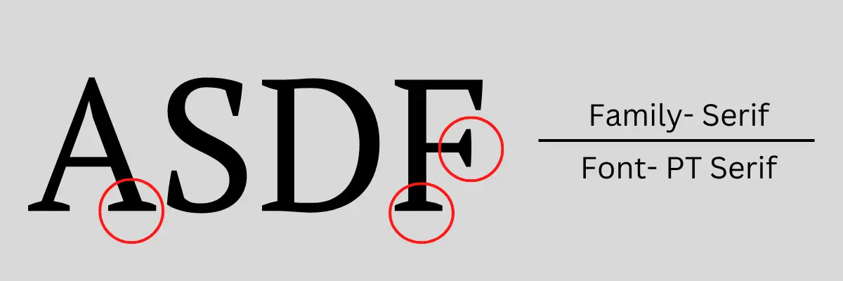
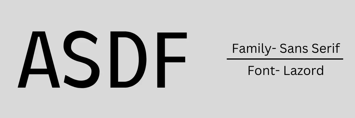
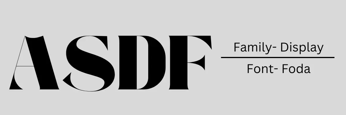
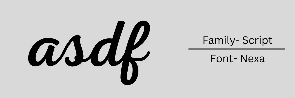
There are four main types of font families that a website owner should know, Serif, Sans Serif, Display and Script.
I'll differentiate each one of them so that you can spot which type of family the font belongs to.
Serif

Fonts which are heavy on the feet and head and have extra strokes are serif fonts. When you look at these fonts you would feel like you are reading something old school. A lot of newspapers and print media use this type of font.
Sans Serif

Sans Serifs are similar to Serifs less the extra heaviness and strokes at the end. They look slim, and sleek, they are modern and are used by most websites for content.
Display

These types of fonts are used for decoration display, they are big and heavy most of the huge billboards, flyers and other print media use this type of fonts. Some of the logos are made from this type of font.
Script

These fonts are like a person's handwriting, they look really nice in some places. Just for example when you want to display your signature on the website this type of font family works really well.
Other Typographical Factors
There are a few factors that one should keep in mind as they play a big role when it comes to website content. These are Bold, Italics, Size, and All-Caps when applied to the content they speak to the readers.
Bold
Use this when you want to bring the reader's attention and when you want to emphasise a lot.
Italics
Italics are used when the level of emphasise is less than bold but also bring a decorative look to the running sentence.
All-Caps
This is another way of bringing the reader's attention but All-Caps should be avoided in a running sentence.
Keep in mind the above three should only be used when required and also on just a few words. Using Bold and Italics on the whole sentence or paragraph will make the writer lose the ability to emphasise.
Size
The size of the fonts should be in line with the hierarchy of the content structure i.e H1, H2, and paragraphs.
Importance of Typography in Website
I must emphasise that the site owner should give time and notice the effects of typography.
Let me start by telling you that if you keep the font default then your site will display differently across operating systems and on different web browsers. Nobody wants that, the site experience should be uniform across different OS and browsers.
If you chose a font that is difficult to read or is too small or too large that counts as a bad user experience.
Having a suitable good font with stable factors will be easy to read and lead to a good user experience. A good long user experience will have a positive effect on the page's SEO.
Typography and Websites
Now, please understand that there is no magic formula that a particular font will work on every site. The website owner has a ton of fonts and types at their disposal it is the work of the owner to apply and see what works best for the site.
There are certain guidelines that one should follow:
1# Try to keep font family and font type to a minimum as possible, changing fonts is not a good experience. At the most one can use 3 fonts, one type of font for headings, one for content and the last for other decorative purposes.
2# All-Caps should be limited to headings. Writing All-Caps in content is difficult for users to read.
3# Sans Serif fonts should be used for content.
4# Size matters and you should be testing the appropriate font size. The best way is to show different sizes to a few people and ask them which size they found the easiest to read.
5# Spacing between lines and characters should also be tested.
Where to Find Fonts?
There are these wonderful places that have plenty of fonts to choose from and even if you have to buy a font don't hesitate because it is a good one-time investment and fonts stay on the site for a very long time. It is one of those things that directly impact your user experience.
These sites have free as well as premium paid fonts.
Now that you have a basic understanding of what typography and font family is it is time to apply them to the website.
Closing Thoughts
Typography in website design plays a very crucial role and everyone should pay more attention to this. Fonts on a website are such a small thing that it usually goes unnoticed but this small thing plays a huge role in user experience.
Now I have just scratched the surface there is a lot that goes into deciding the font for your site. Before understanding the importance I also thought I will just use Helvetica for my site but that is not free. Also when you call a default font in your CSS that just means you want your site to be displayed with that font. If the person who is viewing the site has that font installed or the browser has that font the site will be displayed with that font.
Even when you have a font embedded in your CSS the different browsers tend to show things differently, especially when it comes to colour. So, always try to view your own site in different browsers.
I believe a beautifully designed site along with good typography complements each other. Which definitely will have a positive effect on the overall performance of a website.


